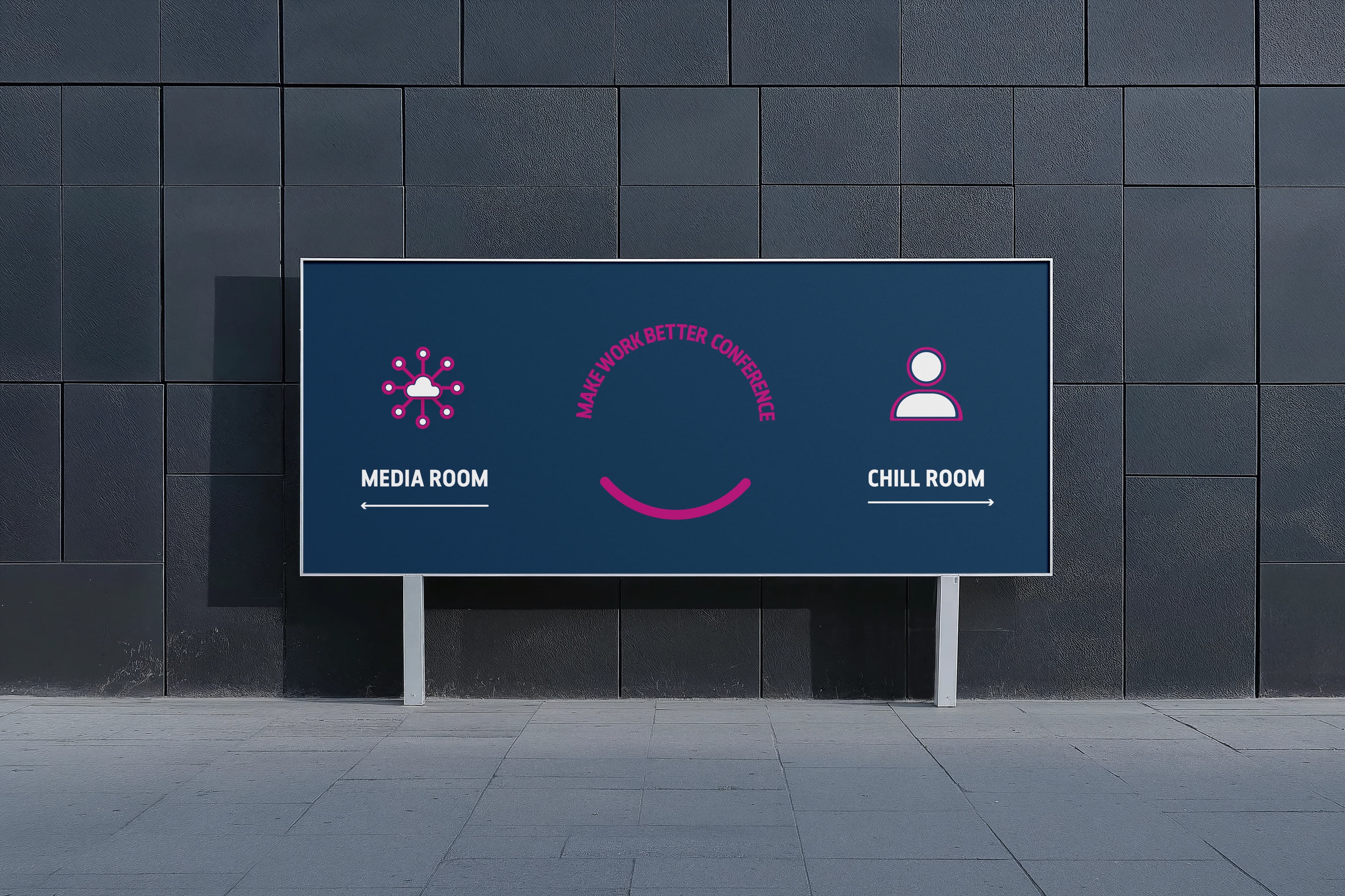
Make Work Better Conference
Event Identity
Role | Lead Designer
Scope | Sub-brand identity · Conference logo design · Motion sequence · Icon system · Environmental and wayfinding design · Pocket conference booklet · Lanyards and branded merchandise · Digital screen assets · Print and signage production
Outcome | Conference is held annually.
Investors in People needed an identity for its first-ever conference. The challenge was to create a sub-brand that felt connected to the parent brand while giving the event its own distinct identity.
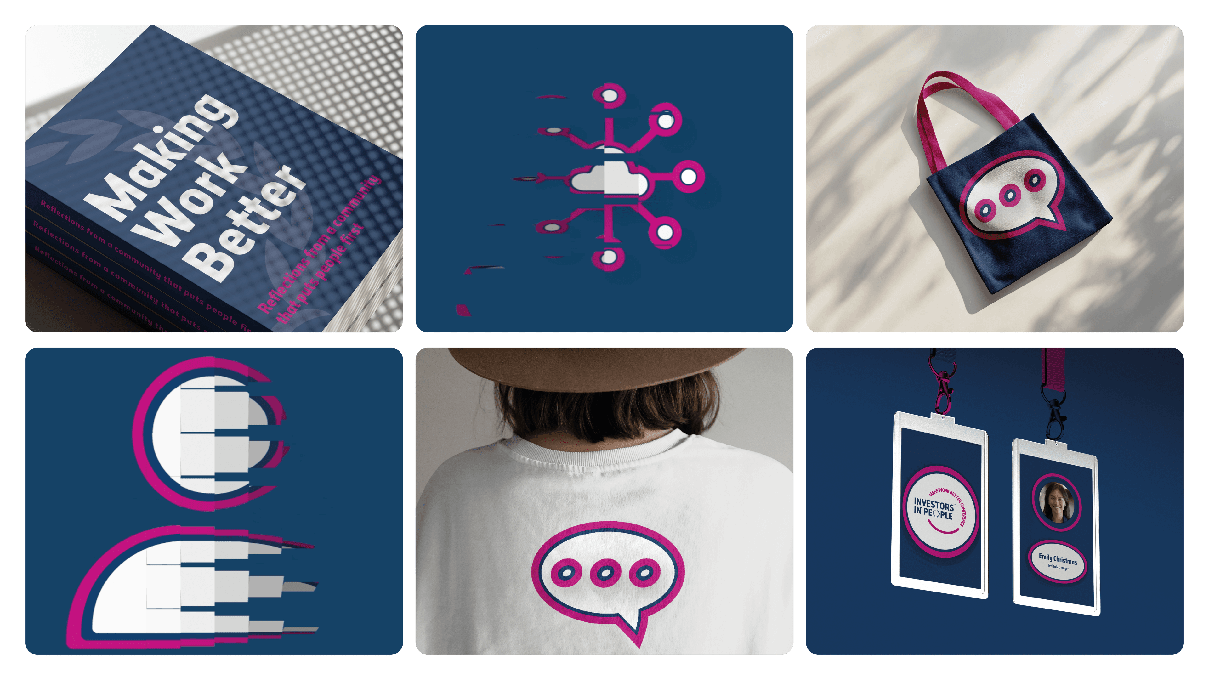
I designed a conference logo that balanced recognition with a look and feel of its own, then developed a motion sequence that builds the logo from its component parts. The animation was used across the event’s digital touchpoints, from promotional screens to transitions between sessions on the day.
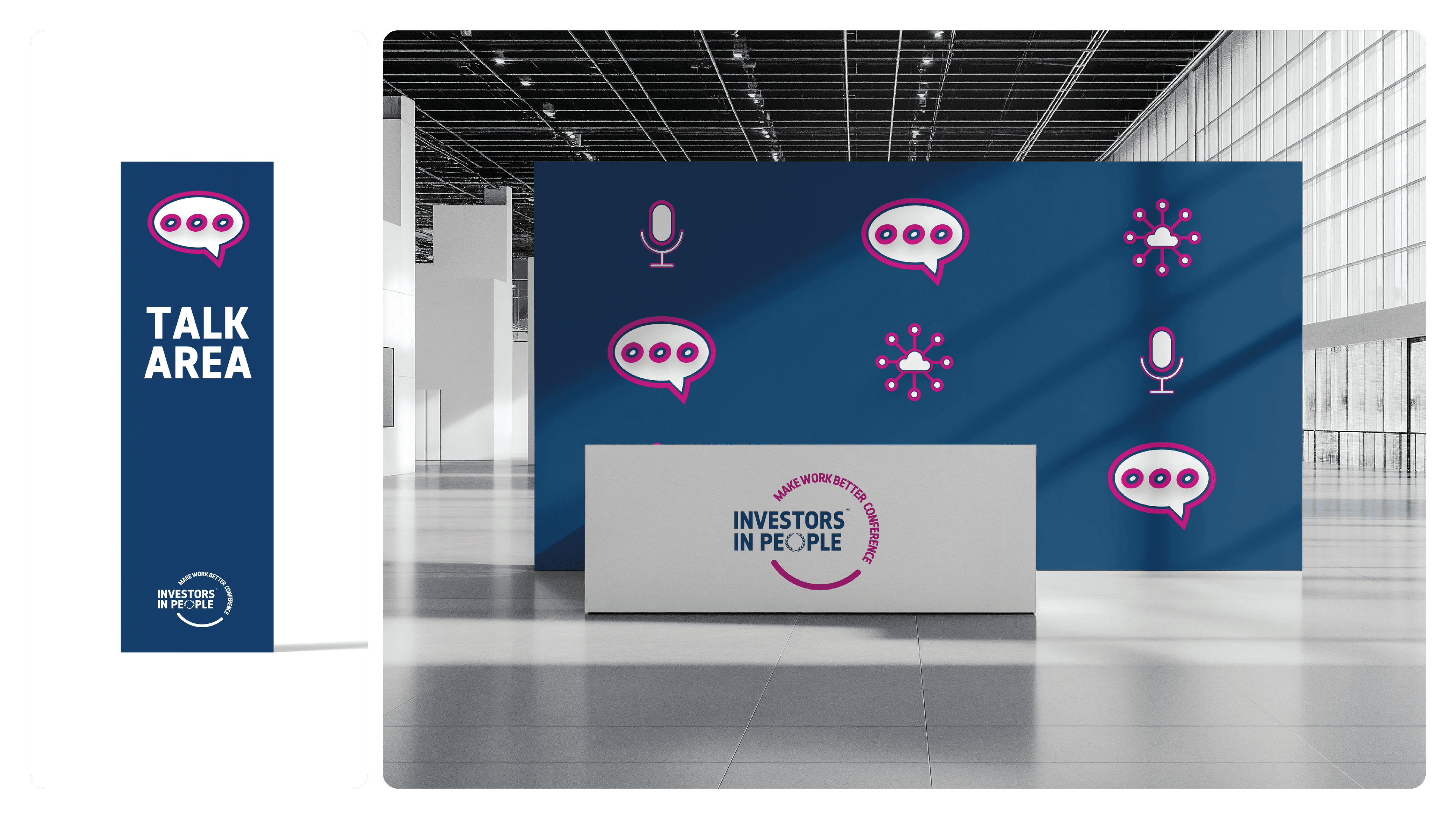
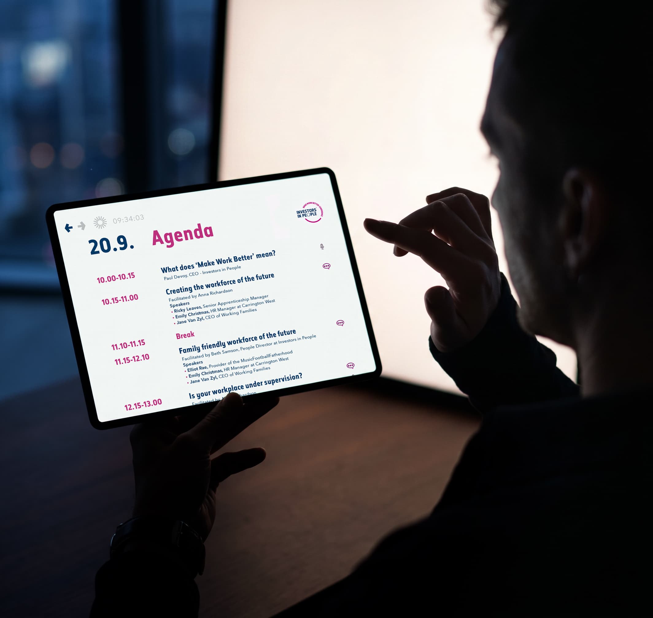
A custom icon set became a key part of the identity, giving each conference zone its own visual marker, from talks and networking to media and people spaces. Designed to work across signage, lanyards, screens and print, the icons created a consistent visual language throughout the event.
For the conference booklet, I focused on making it genuinely useful rather than just something attendees picked up at registration. A pocket-sized format, clear running order, participating companies and traders, and integrated note-taking pages made it practical to carry and use throughout the day.