ClientAppartamento da Andrea
TagsBrand Identity · Hospitality
RoleBrand Designer
A hospitality brand rooted in place.
The Brief
Starting point
Before sketching anything, the building had already made most of the decisions.
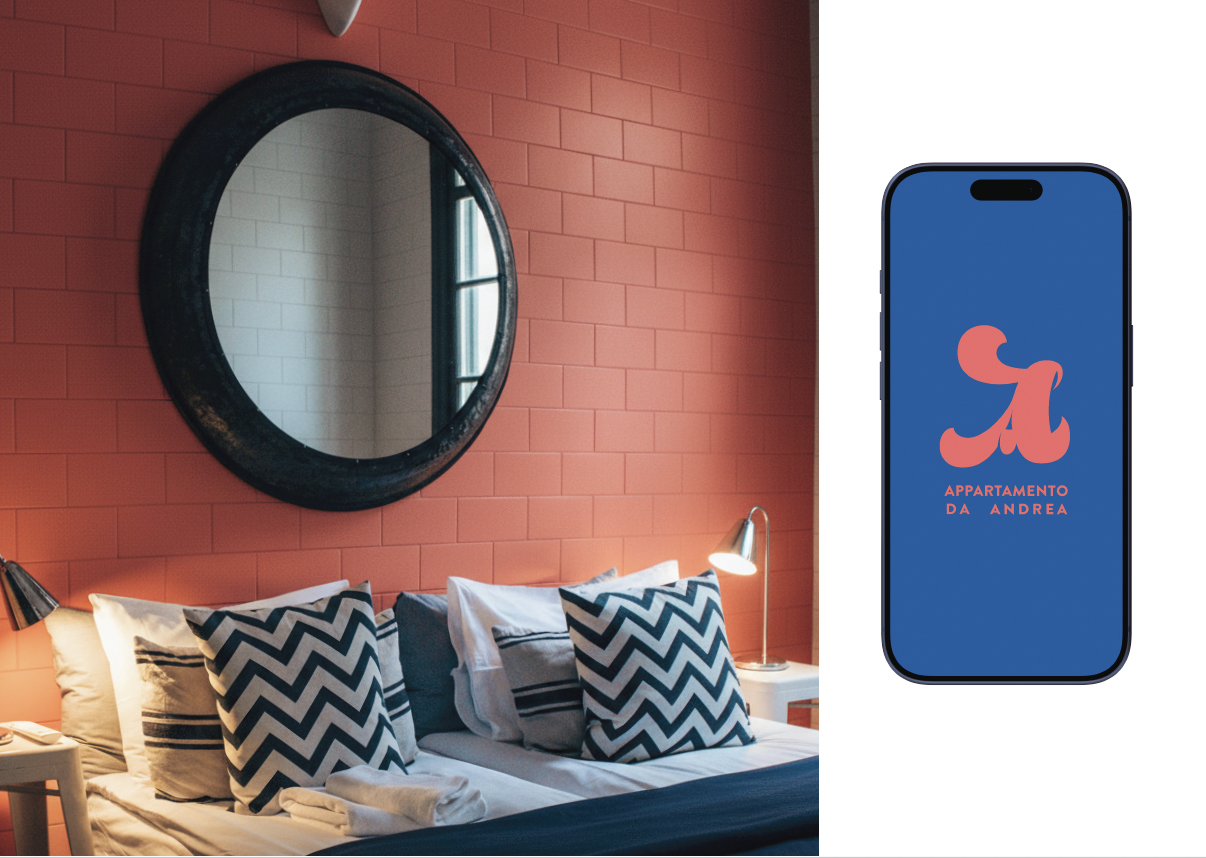
Terracotta walls, a cobalt blue door, lemon trees spilling over the entrance.
Salmon, cobalt, warm cream.
The question wasn't what to add — but whether to invent something new, or build the identity from what was already there.
What became clear
The identity didn't need to be created from scratch.
It needed to be systematised.
The building itself was the brief.
The Approach
Logo approach
Different directions were explored — a refined wordmark, a more illustrative mark — but both disappeared at smaller sizes or felt too detached from the character of the place.
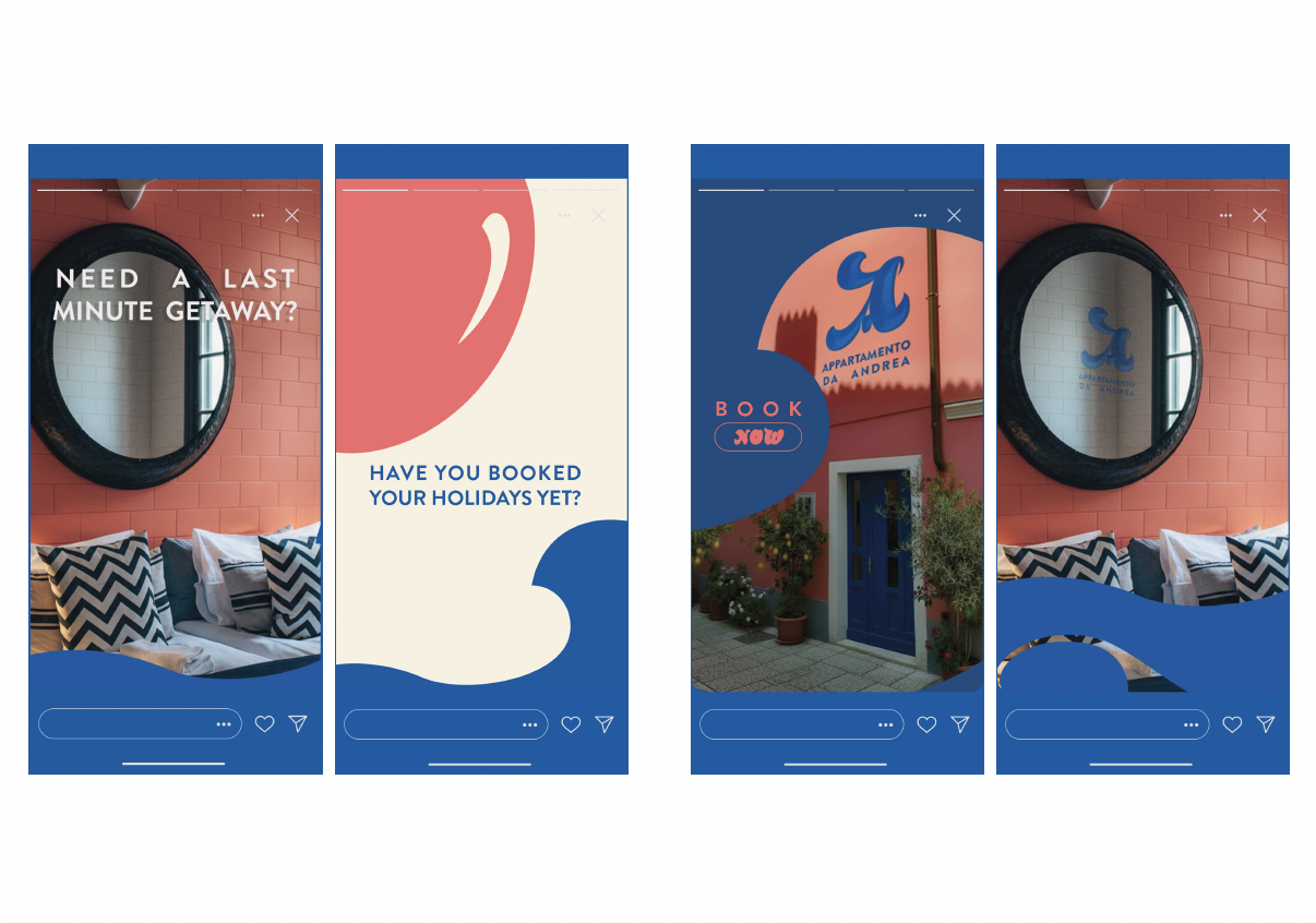
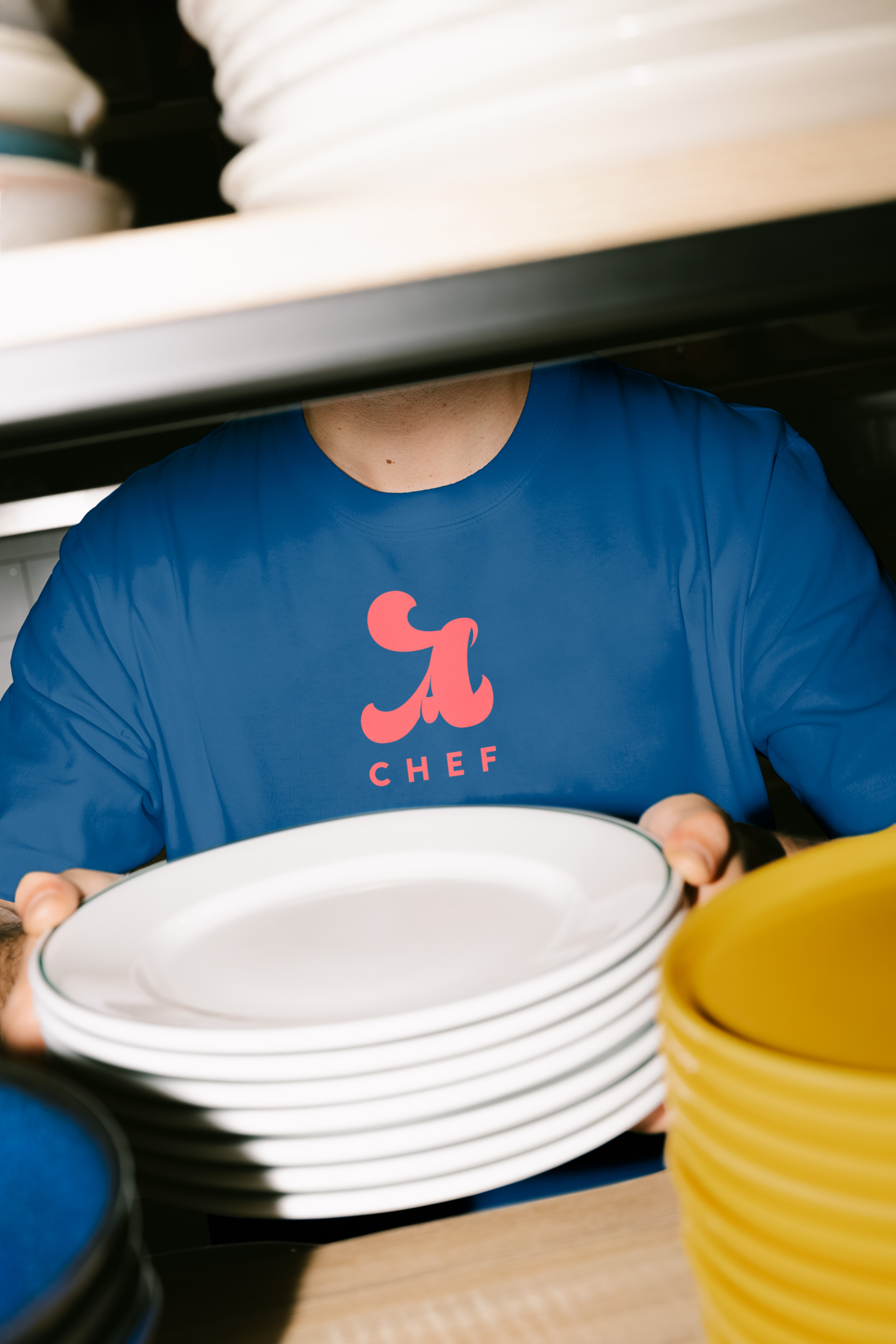
The final 'a' logomark is fluid, informal, and confident.
It was designed specifically to survive compression, with every application tested at thumbnail size before anything else was considered.
System
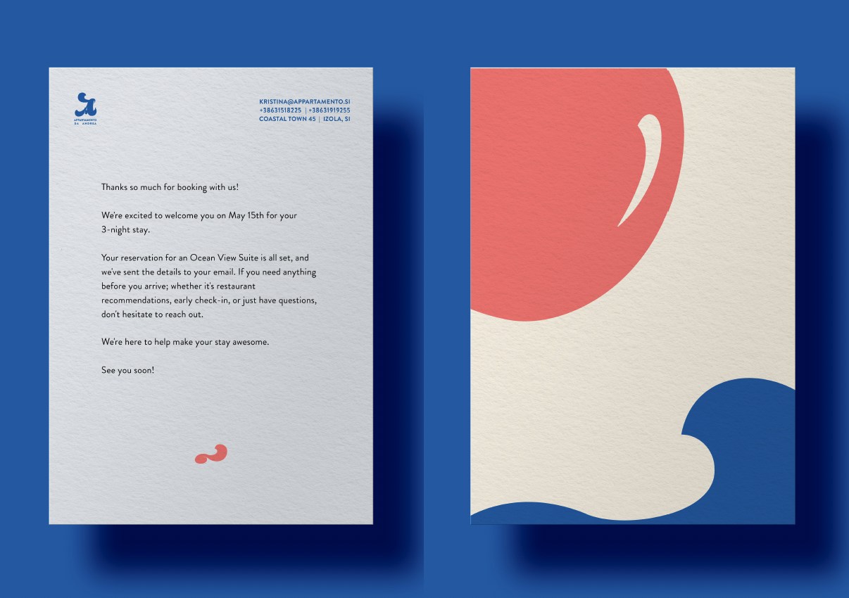
The colour palette is drawn directly from the environment: cobalt and salmon appear consistently across signage, stationery, and digital applications.
The Outcome
This creates a system that feels embedded in the space, rather than applied to it.
Experience
From the room number on the door to the arrival letter that reads like it was written by a person, the focus was on small details.
Those are what make a place feel like somewhere — not just a rental unit.
Deliverables
Brand Identity · Print · Digital