ClientInvestors in People
TagsBrand Identity · Environmental
RoleLead Creative Designer
A conference identity that had to survive the day it was designed for.
The Brief
Investors in People have a strong parent brand — magenta, navy, white — and needed a conference visual system that could carry the event's own identity while staying visibly connected to it. The system had to work across environmental, print and digital touchpoints. And it had to be operational: things change on conference days. Sessions get added. Zones shift. The design couldn't require a redesign every time something moved.
The Approach
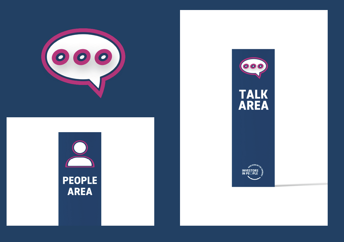
The first decision was the logo — an event mark that had its own presence while remaining clearly within the Investors in People family. From there, the question became structural: how do you build modularity in from the start?
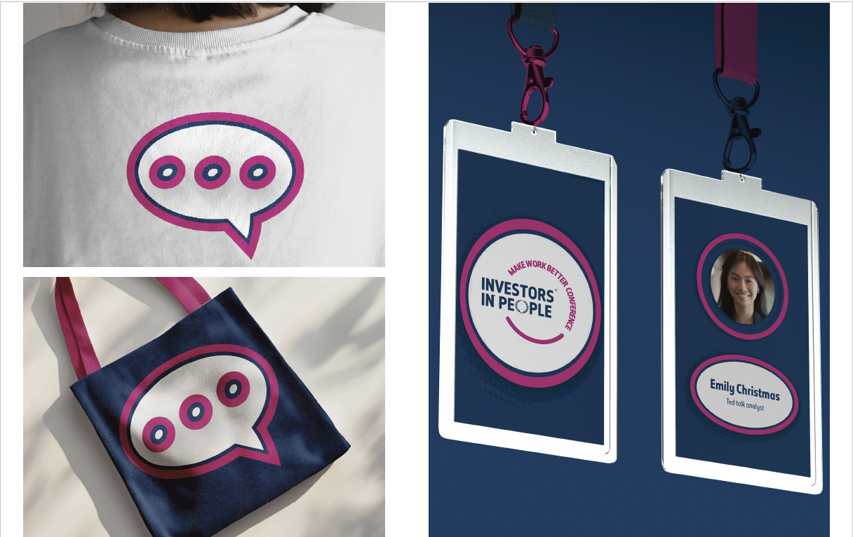
Giving magenta a single functional role was the answer. You see magenta, you know where to go. Everything else — hierarchy, information, navigation — handled with restraint. That constraint became the visual language: clean, direct, confident.
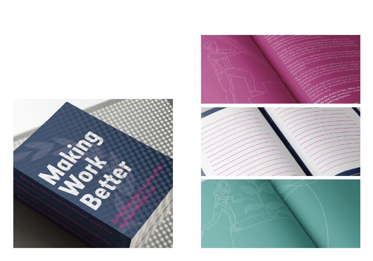
The conference booklet pulled focus during the process because conference guides have a predictable lifecycle: collected at registration, abandoned by the second session. Designing against that habit meant starting from a different question — what would make someone actually keep it in their pocket? Note-taking pages sized to session slots. A format that fits in a jacket pocket without folding.
The Outcome
At the end of the day, the booklets were still in people's pockets.
Deliverables
Visual identity system · Conference logo · Environmental design · Pocket conference booklet with illustrations · Custom workplace icon set · Motion graphics · Branded collateral · Brand application guidelines