ClientFortius Group
TagsBrand Identity · Digital
RoleProduct Designer · Brand Designer
Digital library built by all, for all.
The Brief
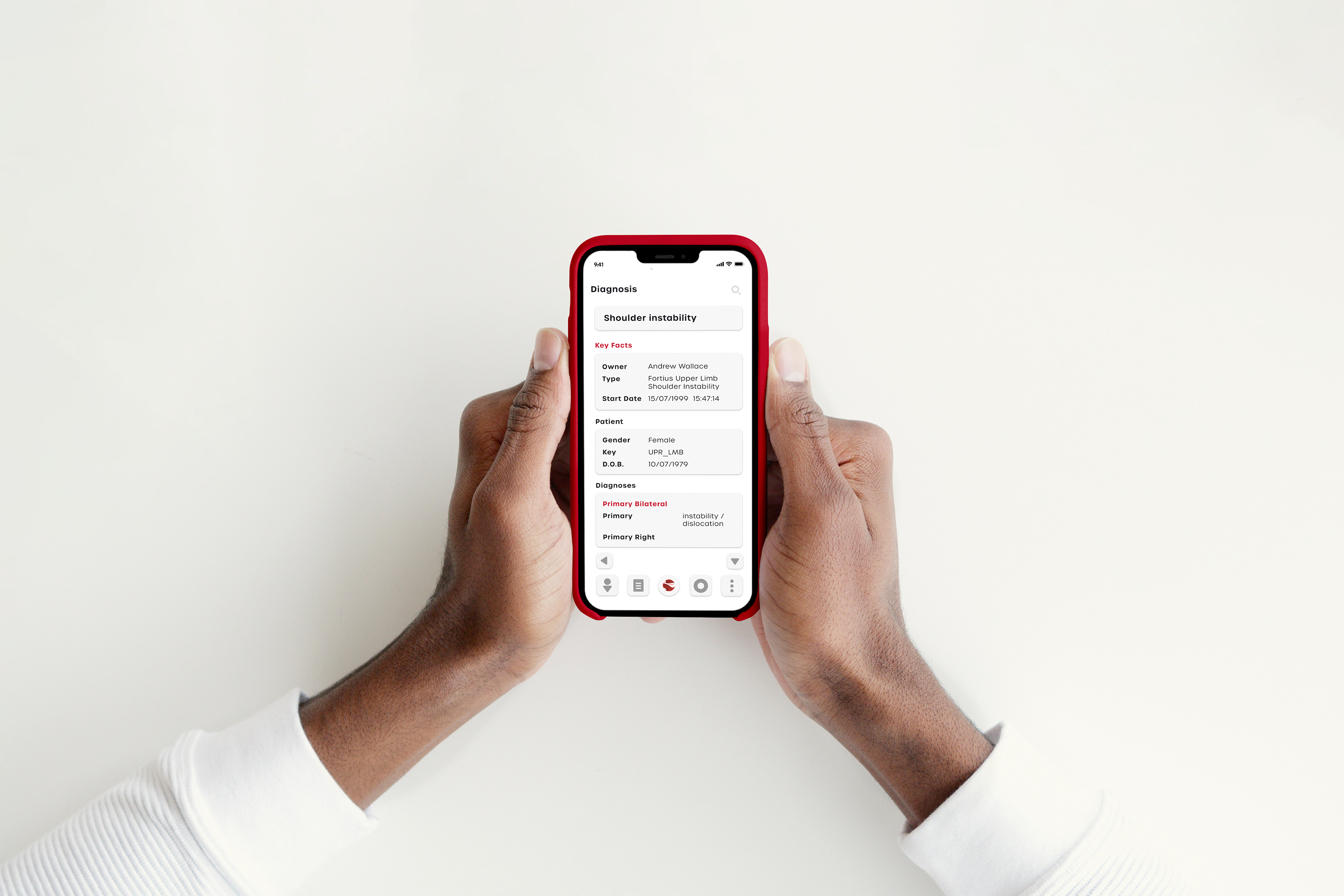
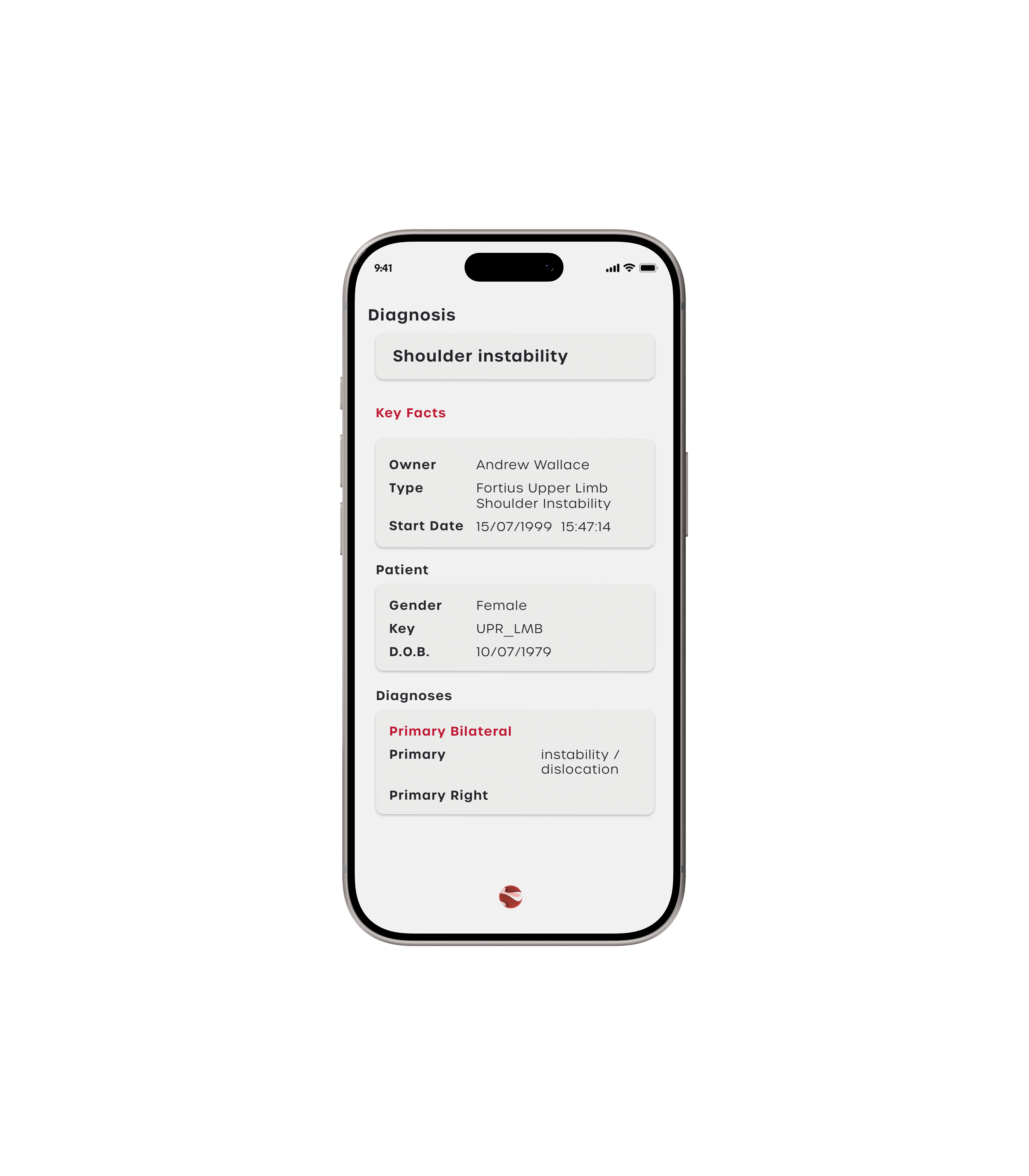
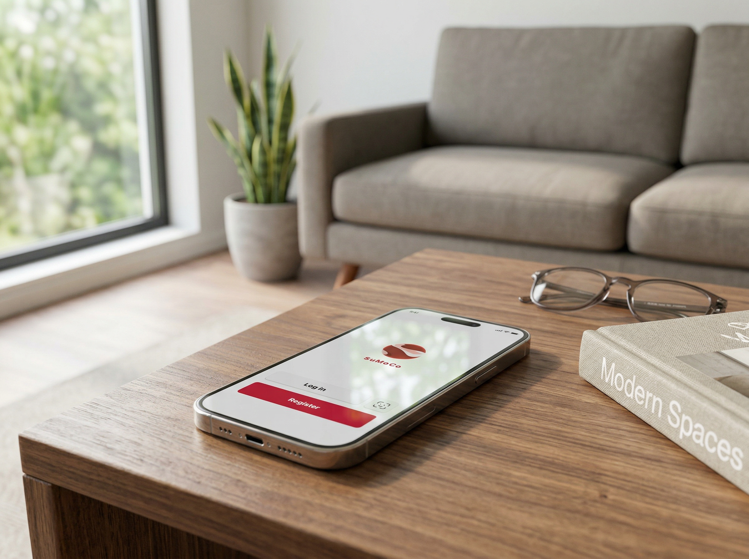
SuMoCo is a knowledge platform built for the clinical team, particularly consultants and physicians to share and access diagnostic insight across the practice.
The Approach
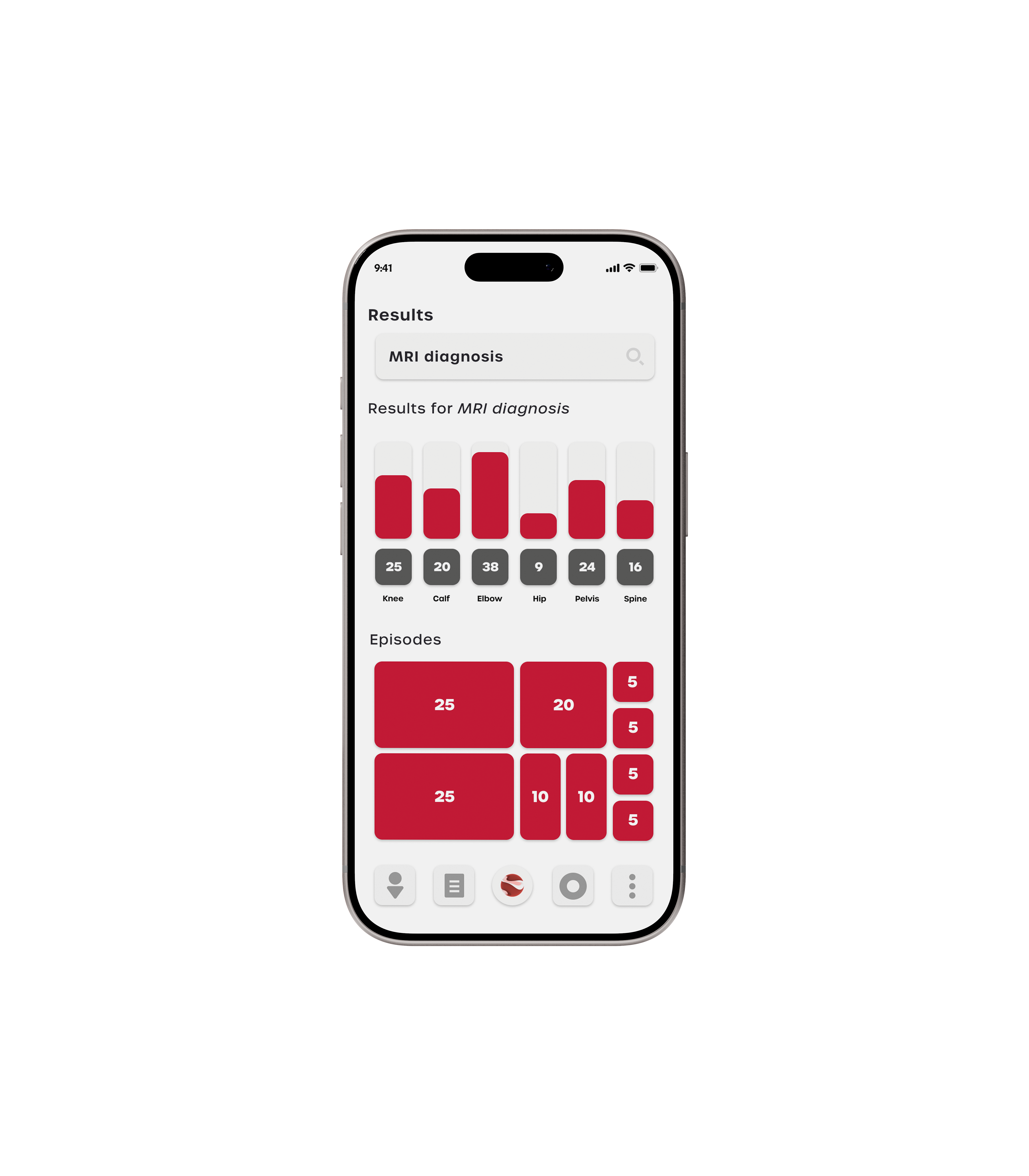
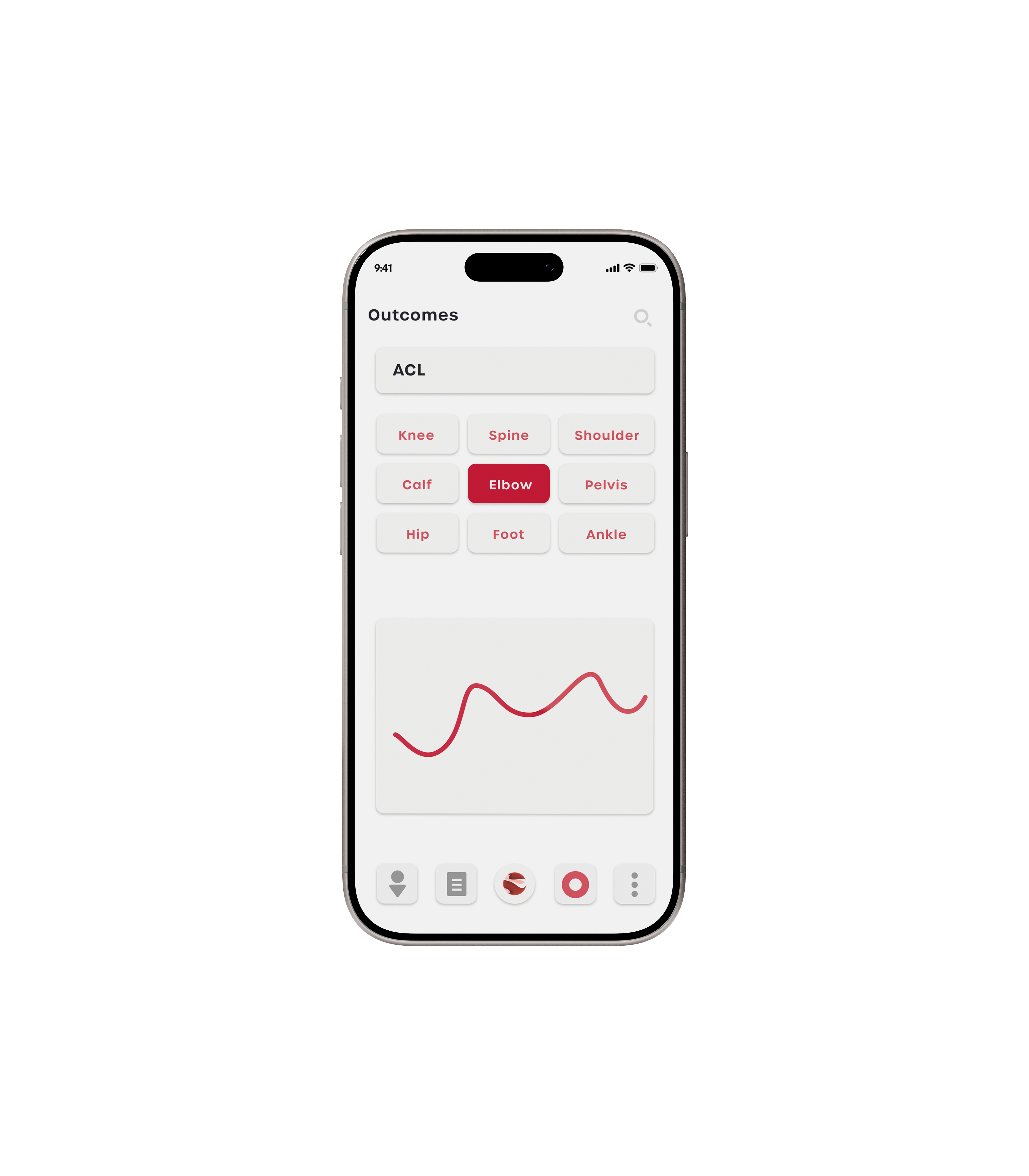
The app gives the team a shared space to log diagnoses, treatments, relevant sources, literature and case notes. Each entry builds into a collective library the whole practice can draw on — searchable by condition, body region, procedure or outcomes or various other search parameters.
The Outcome
When a clinician encounters a medical diagnosis they haven't seen before, and want to share the knowledge or wants to know how something has been treated historically, the answer might already be there.
Deliverables
Brand Identity · Motion Design · UI System